Review of the Large Moleskine Lined notebook

The large Moleskine is one of the most ubiquitous journaling notebooks out there. It’s the model for other companies’ clones, some of which excel the Moleskine in some way or another. However, the Moleskine is an excellent product in its own right.

Less expensive or similarly priced notebooks get several things wrong. For one, other brands don’t know to lower the contrast between paper, ruled lines, and a person’s eventual writing–Moleskine uses ivory colored paper and narrowly spaced, gray lines, which makes looking at a page easier on the eyes.

Another feature of the Moleskine is how consistently well made they are. Moleskines do not tend to fall apart even with careless use, like being tossed in backpacks or being dropped. I’ve had a Leuchtterm notebook, which is made in Germany, start falling apart on me in many places at once. The Moleskines are better built than they’re given credit for.

The Moleskine paper is frequently criticized but it’s decent paper. The Moleskine is not a fountain pen notebook and too many people knockoff points when they find their inks bleeding to the other side of a page. It’s simply the wrong notebook for that use.

A less commonly remarked feature is its size. The Moleskine notebook is narrower than other notebooks, which makes it more convenient for carrying in some women’s handbags. I think the slimness adds to its appeal.

Of course the Moleskine comes in many interesting colors, including my favorites: orchard yellow and red. A color other than black makes it easier to find in a cluttered work space.

Once again, there are Moleskine clones out there that improve on the Moleskine, for a price. My favorite is the Rhodia Webnotebook but I’ve never seen this for less than 19 dollars and the Moleskine frequently goes for about 11 dollars on sale at Amazon. Both are good notebooks, but if money is concern, then the Moleskine shines. It’s style at an affordable price.

The Pentel Energel RTX .5 mm retractable needle point pen

The Pentel Energel RTX .5 mm retractable needle point pen (whew, that’s a long description) is as smooth a pen as I’ve ever used. I tried out a 3-pack of purple Energel RTXs with a medium .7 mm point before I plunked down the money for a twelve pack of needle points. Next, I’ll probably get a pack of .7 mm black pens but I’m going to try to make the .5mm work for me first. I need to use what I buy.

/home/wpcom/public_html/wp-content/blogs.dir/46b/71488093/files/2015/01/img_0424.jpg

I’ve been looking for a pen to draw on top of graphite and colored pencils. I can’t remember where I heard about these Energels or why I considered them for drawing. Till now, the only pens that I’ve gotten to go on top of pencils have been ballpoints but the ink in these tend to be less saturated than gel inks, which are more vibrant. The ballpoints were too grey and the gel inks have tended to skip way too much to be any good.I practiced with the purple .7mm pens and liked the results. The .5mm pens have even cleaner lines — the ink doesn’t pool as much as with the .7 mm pen; and there’s minimal skipping; and the blacks are nice and dark.

I hope other artist community discovers these pens and put them to good use!

Pilot Metropolitan fountain pen

I picked up the Pilot Metropolitan pen after hearing so much about it on the Pen Addict podcast. The podcasters, Brad Dowdy and Myke Hurley, made a lot of noise about this pen. Anyway, I got hooked on buying the pen after considering the positive discussion, coupled with the low cost of getting it. I’ve never owned a fountain pen; I never even considered owning one. I always saw them as either status symbols or as tools for calligraphy — none of which particularly interests me. But the fountain pen discussions on the Pen Addict were insistent and I got curious.

/home/wpcom/public_html/wp-content/blogs.dir/46b/71488093/files/2015/01/img_0428.jpg

But if I was going to get started, I needed to keep it inexpensive and there was one clear winner after all the discussions, the Pilot Metropolitan.

I’ve now used the Metropolitan and the thing’s actually good… for writing. It has a very smooth and consistent line, with no breaks. I’ve written on my Moleskine Folio and Rhodia Webnotebook and both papers handled the stock ink very well. It’s a medium nib, and the line’s not too fat and definitely not too thin. It’s…just right. I also picked up the Pilot Namiki ink refills — which look to be budget inks — 6 dollars for 12 refills. For about 22 bucks, I got the pen and the refills. I call that cheap, about what I like to pay for a 12 pack of very good disposables. It’s a smooth write — I hear the best of all pens in the price neighborhood.

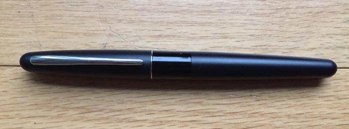
The Metropolitan is a no-nonsense pen. Capped. There’s the matte black of the two halves, a thin chrome band and a shiny black middle. Nice looks, but not too attention grabbing. Uncapped, the chrome area expands, like the reveal of more leg in a dancer. And that’s it for the looks. There’s pens out there that are prettier and even jaw dropping beautiful. This one’s a Plain Jane.

The pen clicks quietly when you cap it — I’d be wary of traveling with this in my pocket or loose in my backpack. This guy’s going to be staying home.

I was considering a Lamy Safari but I hear that it’s scratchier than the Metropolitan and more expensive. My next purchases are likely to be inks, like the Iroshizuku from Pilot, and some other Pilot pens. Pilot it seems knows fountain pens and give good quality at all price points. Imagine that.

If you consider the countless pens and nibs ever made and the many inks, then you have a universe of experiences — more than what you have with other writing tools. These things combine in different ways.

On the color front, I see the different inks as conducive to writing, different colors for different moods. Color should not be a barrier to writing, am I right? So, we need tons of ink. Pink, purple, baby blue, indigo…yes, I said pink.

For me, this pen is but one more writing tool to add to the arsenal but did I really need another one? :\